
We’ve redone every house we’ve owned and our current home is no exception. We bought our house a little over 5 years ago and it feels like there has been at least a few reno projects going at all times. Some of them have been big construction projects, and others just a fresh paint color. Our primary bedroom is one room that I really hadn’t spent much time on in all of those 5 years…until this summer.
While doing some construction in our basement and replacing some interior doors on the main floor a couple of years ago, we had our favorite construction company widen my closet opening so I could access the whole thing (Precision Remodeling and Construction, for my local friends). That’s been the extent of any design work in that room though. While a great size, our primary was dark and forgotten. A spruce up was long overdue! Design is all about noticing the little things. Here are some of the best things I did during that renovation. (Check out the before and after on my reels!)
1. Paint Color
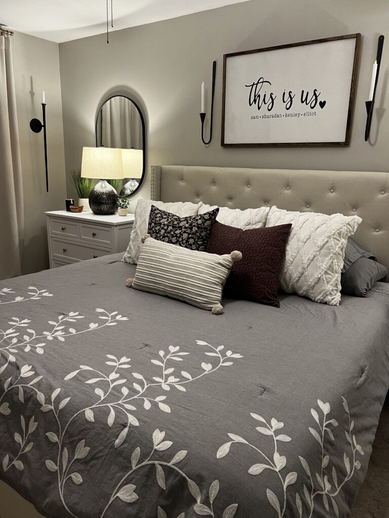
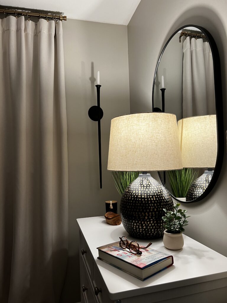
When I’m reimagining a full room or want to make a big impact with little expense, I always start with paint color. Years and years of remodeling, and I’m still always so pleasantly surprised with how much difference a new coat of paint can make in a room. My vision for our bedroom was definitely to make a shift from dark and heavy, to much lighter and peaceful. Choosing a great neutral was the way to go for the walls. I like to change out bedding and accessories. Sticking with a dynamic neutral on the walls lends toward easy change ups when the mood strikes. Revere Pewter is a classic neutral that will complement most design styles and lighting.
2. Window Treatments
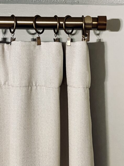
Another great way to transform any room is to take curtains all the way to the ceiling. It draws your eye up which always makes the room feel larger. The curtains stay closed most of the time in our bedroom so I went with a black-out lined linen shade for the fabric choice. There is some subtle texture in the fabric which gives it a bit of movement. Aren’t these understated capped curtain rods great? Using the clip rings is another pretty touch that adds some texture and movement in what might otherwise be a moment that falls sort of flat using similar colors together. I’ve ordered another set to change out in my library/home office.
3. Furniture Scale
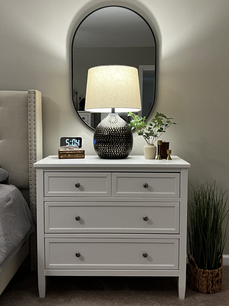
One of the very best choices I made for this project was to go big with the nightstands. The wall that our bed is on is very long. Using larger pieces not only provides tons of extra storage, but they help to fill the space without cluttering it up. Want to know a secret? These nightstands are actually baby dressers! They are a considerably less pricey option than actual nightstands of similar size. I love how light and bright this part of the room turned out but I have such a penchant for moody moments. I go back and forth about whether I feel like I need to add some more dimension to the room. I may paint the nightstands at some point. A dark olive or navy maybe. Or a great soft black. What do you think?
4. Anchor the Space
On a related note, one of my very favorite choices I made in this room was to anchor the nightstands with the black trimmed, oval mirrors. Gah, does this simple addition work so hard in a large room like this! Using several similar light neutrals is a great way to make a room feel like you can really breathe in it but it can also fall flat really easily. These mirrors add a ton of dimension and symmetry. Good design is all in the layered details. The shape of the mirrors and the lamps in front of them add some intentional softness to this room. Side note: I love these lamps. I tried a few different ones here and am really glad I went with these dark and curvy ones. They’re fairly large, which was helpful in styling the bigger nightstands and filling the space on this long wall. Find some of my fave surface styling tricks in my most recent previous post.
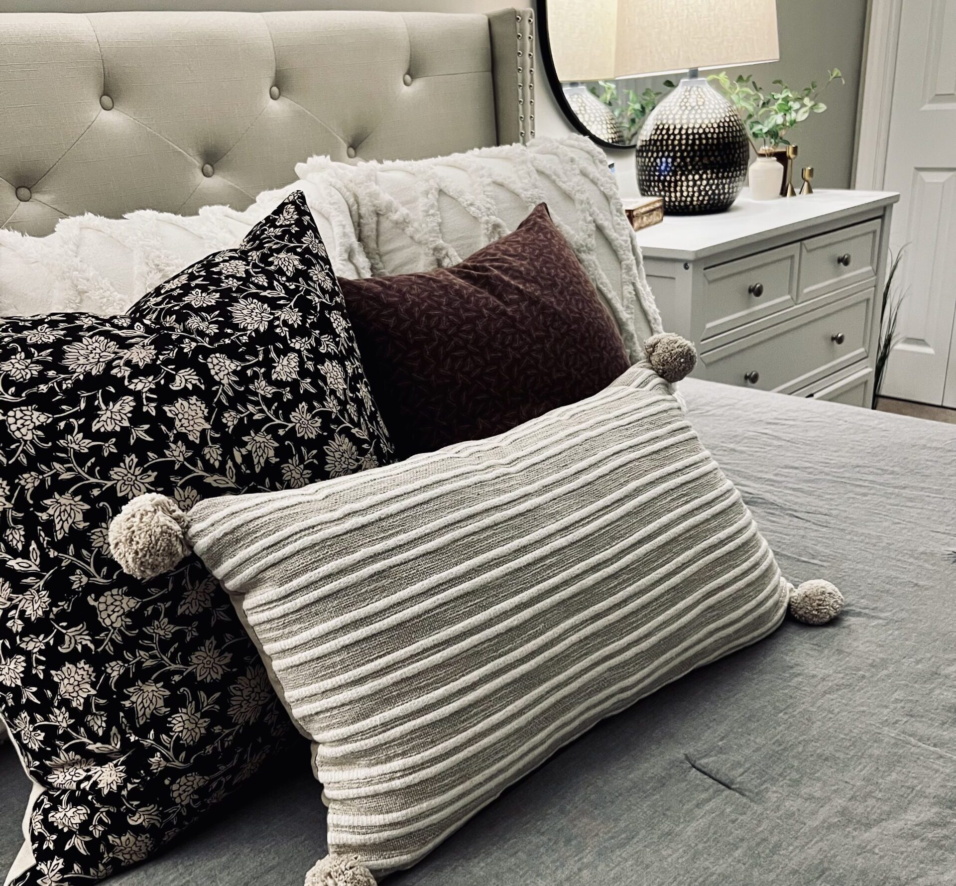
5. Texture and Pattern
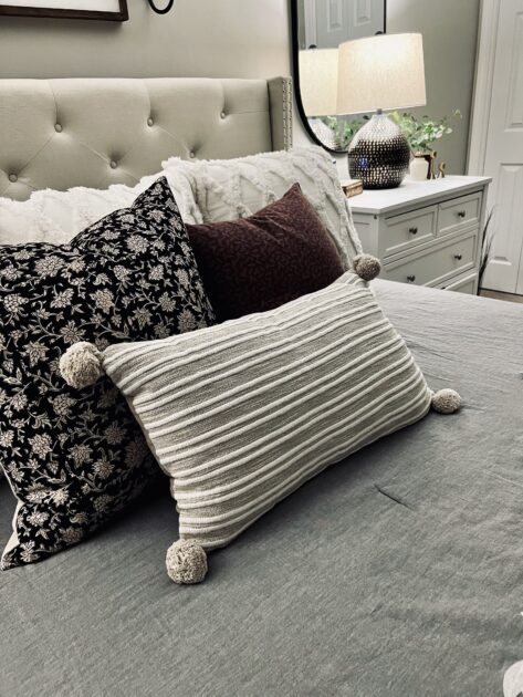
Another purposeful choice I made to keep the room from falling flat was to introduce a lot of texture and movement with the pillows. When I’m designing a space, big or small, I always have an image in my mind. Getting that out of my head and into the world can be tricky when I’m struggling to find just the right pieces. I had a clear vision of the colors I wanted to use in the pillows to add some dimension and interest into an otherwise light and neutral bed. I looked and looked for a pillow cover pattern that felt right in this purpley/burgundy color family, with no luck. Rather than giving up, I hit the fabric store. My mom is an accomplished seamstress and so generously agreed to make this cover for me.
I love having a piece of her work in a room that I love so much. As my family enjoys teasing me about, I have a thing for accent pillows. We have tons of them all over the house. It’s pretty special to have one my mom created especially for me.
Nothing here is earth shattering or difficult for anyone to accomplish but, man, does it all pack a punch. This room is now so peaceful and inviting. What a gift it has been to create a sanctuary to begin and end our days.
Your home should tell the story of who you are, and be a collection of what you love
-Nate Burkas