You all are always asking me how to style or decorate particular types of furniture or surfaces in your spaces. There is something magical about focusing on 3rds & groups of 3, despite the furniture piece size. Variations in odd number groupings work well in large areas or in groupings of smaller items, too. In my mind, creating a triangle of sorts in the vertical space above a furniture piece seems to be the most pleasing to the eye. Larger items start in the middle and the other 2 outside groupings sort of come down in size from there. I’m a growing fan of offsetting the tallest object from center a bit and centering the whole middle grouping, not so much just the tallest piece.
There are so many little moments in a home where playing with styling can really elevate it to look like the carefully curated space it is. There will be more of my fave tips and tricks in future posts but keep reading for some help with a few of the most common pieces of furniture that we like to take advantage of using styling to express how we want the room to feel!
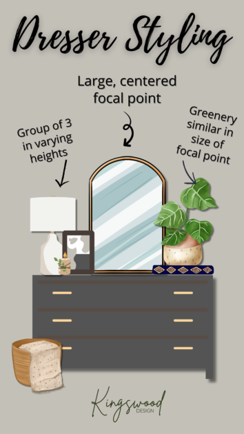
Dressers come in such a variety of shapes, sizes, and finishes. It’s a great rule of thumb to start with a large focal point and build from there. A great way to keep the heights varying but proportionate is to stack a beautiful book or two under an item that needs a bit more height. Coffee table books are always on my thrift and vintage list. I’ve been asking so many times how I know what to grab. Check my socials soon for more on that! Layering objects of varying heights and depths can also help to ground larger objects (in groups of 3, of course!).
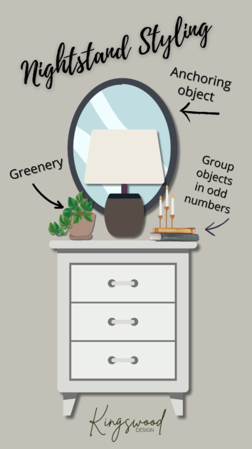
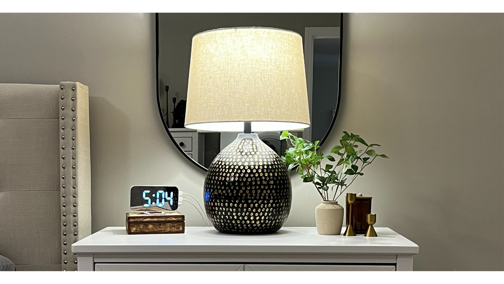
Nightstands are pretty utilitarian and have to be functional, in addition to pleasing to the eye. Because the get used for so much, it’s a surface that can quickly become cluttered. We all know by now that clutter in a bedroom, especially, wreaks havoc on our sleep. When you’re intentional about how you style a surface, maybe you avoid cluttering it up with all that’s in your pocket at the end of the day! I love anchoring nightstands with a mirror or artwork on the wall above them, especially if you have one on either side of your bed. If you’re using a standard width nightstand, I’d stick with centering your lamp or other item that serves as the apex of your triangle. However, throw that apex item off center a bit if you have a wider nightstand. This would also allow you to move a lamp closer to the bed in a wider nightstand. If you’ve seen peeks at my home, you’ll see tons of greenery and organic materials (wood, rattan, etc.). It does so much to warm up a room of any color palette. I recently redesigned our primary bedroom. Check out what I did with our nightstands (and the rest of the room) here.
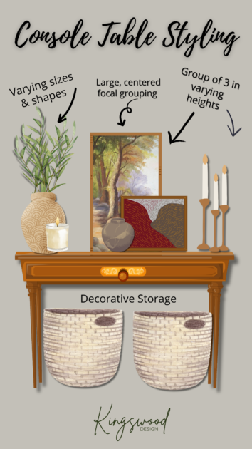
Console tables can vary in size to a good degree. Much like most surface styling, there is something magical about focusing on 3rds & groups of 3, despite the furniture piece size. Again, creating a triangle of sorts in the vertical space above a console table seems to be the most pleasing to the eye. Adding some decorative storage underneath is a great trick. It helps to balance and complete the look and is practical.
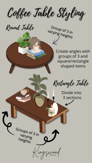
Coffee table styling can be challenging, for sure! You want it to be pleasing to the eye but also be functional. If your house is like mine, my kiddos’ things end up taking up a ton of coffee table real estate. Start by dividing into thirds. A square coffee table would be ok to think about in fourths or thirds. I like my groupings to be pretty tight in most cases but feel free to spread out any groupings of objects until it looks correct to you. A simple larger object or vase or vessel with flowers/greenery in the center of any shaped coffee table is such a simple and elegant styling solution, too!
Home takes time. In all areas of your home, start with objects that you love and build from there according to the tips above. Layer your pieces to create a collected and lived in look that feels like home. Play around, trying different combinations or placements. I almost never get a vignette correct the first, second, or third time. I bet you’ll just know it’s right when you see it! Mixing old and new items creates so much magic, too. I love to make my home look and feel as carefully curated as it is. Mixing in some great vintage or antique pieces that speak to you helps to keep anything from looking too much like a showroom and allows you to showcase the soul of your home, instead ♥️
Love your work
Thank you!